Whether your battle-tested website is ready for a refresh or you’re launching something new, we have some timely tips from a seasoned design pro on upgrading your site.
Graphics, templates, third-party plugins … oh, my. The choices you’re confronted with when setting out to create a website can be truly daunting, especially in a space where the tech and trends are evolving at fiber-optic speeds. So we checked in with Los Angeles-based Ruby Roth, a multihyphenate artist-illustrator-author-web designer who weaves her talents together to create compelling online visual narratives for a client roster that includes everyone from Hollywood celebrities to bootstrappers starting their first business. Read on to see what she has to say about making your next site a click-worthy success.
EH: What are some of the first questions you ask a new client when they come to you for a website project, and how should they prepare for a consultation with you?
RR: Right away I aim to discover any kind of vision they have in mind. I think of the site as a character, and we need to find out how we want users to feel when they meet. This makes it critical to know who your audience/demographic is. From there, we can hone in on how to serve their audience. It’s my job to help “paint” the character of the site with a cohesive set of fonts, colors, spacing, graphics, illustrations, etc., that tell a story and best fulfill the users’ needs — from how they should feel to how they absorb information and learn about the clients’ products or services.
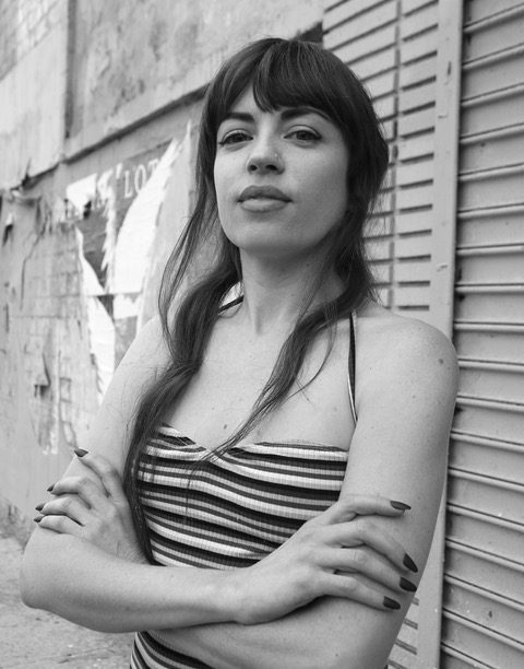
Photo: Louie Robles
EH: You also do many types of illustrations and fine art. What are some of the best ways businesses and brands can integrate this type of work into websites and other projects?
RR: A site is a digital room — your target audience will land there and feel a certain way depending on design. Tailored illustrations, unique buttons and custom icons are all touchpoints that provide an opportunity to communicate with your audience. Sites built with platforms like Shopify and Squarespace can often feel “template-y” — obviously drag-and-drop, without much unique personality. Custom artwork can really make these sites feel unique, stand out and appear more like a custom-coded site. And if you don’t have a library of high-quality, cohesive photographs to use, artwork and graphic design are great ways to fill in the blanks in a way that looks not only intentional but also visually exciting.
EH: There are many web-platform options out there to choose from, but I know you specialize in Squarespace. Can you tell us why you prefer this platform?
RR: Working with one platform for years has allowed me to serve clients with more expertise and provide a range of options more quickly than using billable hours to first lay out platform options. Building a site can be overwhelming and sometimes narrowing the options from the jump provides more creative freedom.
EH: Regardless of platform, there are many plugins and add-ons available. Can you call out a few that you like and recommend to clients? For example, I know that Squarespace offers an integrated email campaign component for their subscribers.
RR: There are so many! For example, whatever Squarespace doesn’t offer, there’s almost always an app you can integrate with your site to serve your needs. This ranges from easy stuff like connecting to a Mailchimp mailing list, to collecting extra analytics, and making an automated series of newsletters. There’s also more complicated automations like using Zapier to trigger a range of actions that includes accepting a payment, which then triggers a Zoom workshop registration-confirmation email.
EH: Can you mention a couple websites — that you’ve done and by others — that exemplify good site design.
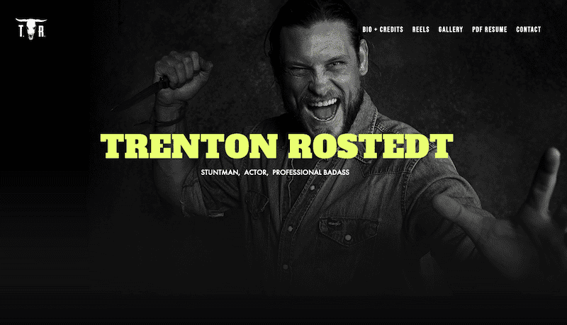
RR: Sites often change after my work is complete. That’s the nature of web design. But stuntman Trenton Rostedt’s site is over five years old now, and I still love the landing page — bold, simple, clean. A bright, heavyweight font over a grayscale photo. These are all decisions that tell a story and give off a feel. I also started Kombucha Hunter’s first design. It has expanded a ton since, but a lot of the original elements remain. Solving for uniqueness, I created custom “feature” templates they could use for photos to make their site stand out from anyone else’s using the same template. At the bottom of the site, you’ll see “Special Features,” “Recipes” and “Brewer Q&A.” Used across pages, this is useful not only for site navigation, but also helps bring a color and style cohesion throughout the site as well.
Sites I didn’t design:
- Dazey LA: Amazing cohesion between design and photography. Fantastic use of color and custom illustration, shapes and cutouts.
- Anne Sage: Clean, simple, lots of breathing room. Reflects her aesthetic and approach to interior design.
EH: What mistakes should be avoided in site design and implementation?
RR: I think one of the easiest mistakes to make is overcomplication and clutter. We often want to include more and more content to show off accomplishments, explain our products, drive more sales. But I feel the most confidence is exuded by simple design. Everyone is overstimulated and has such short attention spans these days — the more you can say with the least amount of content, the better.
EH: What are some overall trends you are seeing in branded websites?
RR: I see more movement these days — ticking text, animated fades/slides, parallax scrolling. I think movement can be great, but just like every other element and choice, it should be used wisely and intentionally and serve a purpose.